
Google News new design being tested
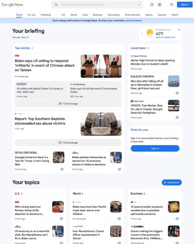
Google is testing a new trail version of the Google News portal at news.google.com. It is a limited trail, I was only able to bring it up once in Safari private mode, but then I lost it. The new home page is more visual, brings the navigation menu from the left side to the top and overall cleans up the look of the home page.
What it looks like. Here is a screenshot of the top of the page that I was able to screen capture when I saw the test – you can click on it to enlarge it:
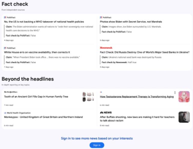
Here is the bottom portion of the page where you can see the “Fact check” section. Again, you can click on it to enlarge it:
When will you see it. Again, this is just a test, just a trial, Google is running to see if those in this test group like the new Google News design and if the responses they expect from the new design is positive or negative. Google is constantly testing new user interfaces across all their platforms, so this should come as no surprise.
Source: Google News new design being tested
Open Source Initiative Launches News Blog on WordPress
The Open Source Initiative (OSI), a public benefit corporation and steward of the Open Source Definition, has launched a news blog on WordPress. In 2021, OSI’s board appointed Stefano Maffulli as its first Executive Director, and he is leading the organization in overhauling its web presence.
The blog was launched on a subdomain of the opensource.org website, which uses Drupal 7, self-hosted on a droplet from Digital Ocean. It’s also tightly integrated with CiviCRM to manage members’ subscriptions, donations from individuals, tracking sponsorships, and sending the newsletter.
As Drupal 7 is approaching EOL in November 2022, the team is planning to move everything to WordPress. They explored managed hosting with Drupal but found it was more expensive and also required them to migrate to a more recent version of Drupal. Themes and plugins made for D7 are not compatible with D9+, so they didn’t see an advantage in terms of time or simplicity.
Although Maffulli wanted to avoid creating a blog under a subdomain, and preferred using the old URL (opensource.org/blog...), mixing Drupal self-hosted with a managed WordPress site was not a common use case with straightforward solutions. If the new blog design looks familiar, that’s because it was inspired by WP Tavern’s new design.
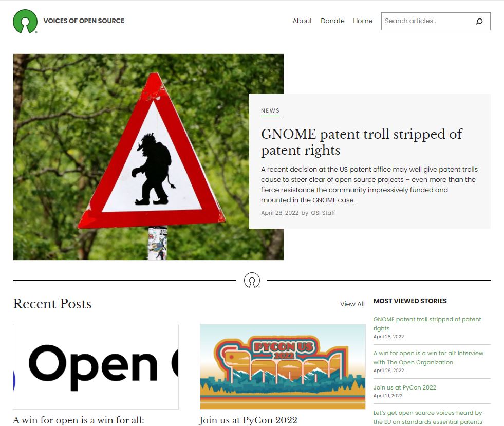
Since the Tavern’s theme wasn’t yet on GitHub, Maffulli contracted a developer who used WordPress’ new full-site editing features to create a simple child theme based on the Twenty Twenty-Two default theme. He said he is glad overseeing the project gave him a chance to learn the basics of FSE.
Some members of the OSI staff were already familiar with WordPress, which contributed to the decision to use the software. The wide range of functionality and third-party integrations were also a factor.
Maffulli said he wishes the WordPress media library offered a more standardized way of storing and tracking copyright information, like the author, source, and license.
The OSI team has opted to keep comments closed on posts at this time, since they do not have the capicity to properly moderate comments.
OSI is also looking into creating a way to give its members the privilege of commenting. This would require a way to integrate authentication with CiviCRM to access members’ records.
The new Voices of Open Source blog has started by featuring the network of OSI affiliates, which boasts 80 organizations, including Mozilla, Wikimedia, Linux Foundation, OpenUK, and more.
Source: Open Source Initiative Launches News Blog on WordPress
Google Unveils New Ads Manager Tools For Video Ads
We all know how important it is to deliver the right message at the right time, to the right customer.
When Google introduced Video Ads, this was a way to reach users in a different way.
However, Google Ad Manager wasn’t built to provide such in-depth insights on a campaign type like video.
If you’ve ever had a difficult time gathering insights for video and programmatic ad performance, this update is for you.
Google Ad Manager announced a new array of tools to save you time, manage your video streams, and grow revenue from videos.
Programmatic Video Health Tools
More in-depth insights from the Programmatic Video Health tool can help you understand the performance of inventory at auctions compared to others.
A new video signals card will show an overview of how your specific video inventory is performing. The signals it reports on include:
- Viewability
- App or web domain name
- Audience information
In addition, these signals report the potential revenue impact from videos. The signals above will make it easier for you to place a value on your video inventory and identifying where certain metrics can improve.
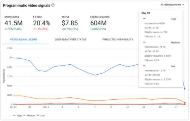
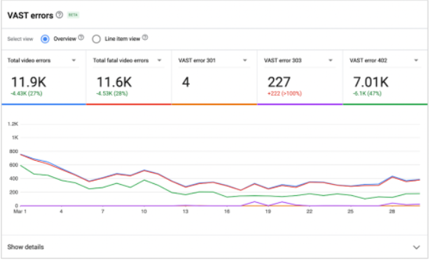
The second tool added for programmatic and video is called the Video Ad Serving Template (VAST) errors insights card.
The VAST errors card uses automation to easily show the amount of errors on your video inventory. It also shows what line items are causing errors.
Real-Time Video Reporting
The YouTube Ads Delivery Tool can test ad delivery in real-time on YouTube inventory.
You’re able to see data such as:
- Ad requests
- Key-values
- Details for winning line items
Why These Tools Matter
Before the video signals and VAST error cards were introduced, you likely spent a lot of time digging through video inventory.
With automated insights, you can cross a lot of manual tasks and report pulls off your list.
On the VAST errors report, you can sort the line items of errors by highest impact on revenue.
Focus on high-impact areas of improvement for your video inventory to drive faster growth with these new tools.
Source: Google Unveils New Ads Manager Tools For Video Ads
Instagram teases quirky, new, eye-catching font as part of identity shift
Instagram is rolling out new brand identity materials for users and influencers to use as part of a “visual refresh” that it hopes will foster creativity in the platform’s various communities.
The refresh is split into three parts: a brand new font for the app called Instagram Sans, a new layout and design system, and a new logo with moving gradient colors. Admittedly, it’s a little confusing as to how users and creators are meant to use the moving gradient logo, but it appears to be a beacon of sorts to bring more eyes to content.
Eye-catching content
Speaking of eye-catching, Instagram Sans was created for that very purpose. It’s the platform’s new global font, which was inspired by the Instagram logo itself. Instagram said it worked with experts to make sure the font works with all types of languages, including those that don’t use letters such as Japanese and Arabic. Instagram Sans sports a circular motif that’s supposed to invoke friendliness. You can play with Instagram Sans on the platform’s website where you can check out the various sub-fonts like Sans Script and Medium.
Growing its audience
We also asked Instagram when can people expect these features to roll out, but we were met with silence. What can be said with some confidence is that this is all probably a part of Instagram’s plan to go after TikTok’s audience.
The layout feature will be full-screen, and back in early May, the platform announced that it’s testing out a new vertical feed that takes up the entire display. It remains to be seen if chasing after TikTok is the way to go in the long term. Instagram’s new font and layouts are certainly interesting, but it’s up to the users to decide if they’re worth keeping.
Source: Instagram teases quirky, new, eye-catching font as part of identity shift
Is Google Search showing fewer sitelinks
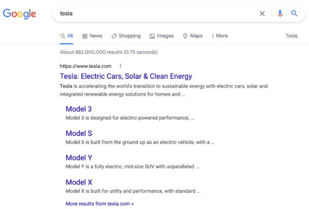
Google Search seems to be showing fewer sitelinks in the search results. Google would show as many as six sitelinks per search result snippet, now Google seems to be showing a maximum of four sitelinks and often just two sitelinks.
What are sitelinks. Sitelinks are links from the same domain that are clustered together under a web result. Google Search said it “analyzes the link structure of your site to find shortcuts that will save users time and allow them to quickly find the information they’re looking for” in the search results.
What changed. Google seems to have changed to a vertical format for large sitelinks and is only showing up to 4 sitelinks. Even the example from Google’s very own help documentation shows six sitelinks.
Screenshots. Here are screenshots showing how a search for [tesla] is showing four sitelinks:
Source: Is Google Search showing fewer sitelinks
More News:
New Yelp feature: Request a Call