Meta Reports First Ever Decline In Ad Revenue
Meta’s latest earnings report reveals the company’s first-ever year-over-year decline in advertising revenue, signaling a downward trend that it expects to continue.
The Q2 2022 earnings report from Meta marks the end of its decade-long streak of ad revenue growth.
We’ll explain why this is significant, what it means for marketers, and what’s next for Meta in light of these figures.
Meta’s Revenue Drop Blamed On Economic Downturn
There are several factors contributing to Facebook’s unprecedented revenue drop.
In an earnings call with investors, Meta CEO Mark Zuckerberg says his company missed targets due to an economic slowdown that’s affecting the whole digital ad market:
“… we seem to have entered an economic downturn that will have a broad impact on the digital advertising business. It’s always hard to predict how deep or how long these cycles will be, but I’d say that the situation seems worse than it did a quarter ago.”
What Are The Numbers?
Meta’s ad revenue dropped one percent in Q2 2022 compared to last year’s period.
Meta brought in $28.82 billion from ads, though it expected to earn $28.94 billion.
Zuckerberg’s Metaverse project, known as the Reality Labs division, is a considerable expense. Work on the project cost Meta $2.8 billion in Q2.
One positive trend to note is Facebook’s daily active users are up three percent. There are now 1.97 billion people logging in every day.
Daily active users across Facebook, Instagram, Messenger, and WhatsApp are up four percent from last year.
What Does It All Mean?
Meta’s apps aren’t declining in popularity by any means.
The audience is there. The problem is that advertisers have smaller budgets, and they’re not getting the same value from ads as they used to.
To remedy the issue of declining ad revenue, Meta has plans to offer new types of monetization. More specifically, the company is working on ways to make money from Reels.
In response to the Q2 earnings report, Zuckerberg stresses his commitment to building Facebook and Instagram around Reels.
The Reels viewer is one of the only sections of Facebook and Instagram that isn’t fully monetized. So it’s not a revenue driver right now, but it can potentially become one in the future.
Source: Meta Reports First Ever Decline In Ad Revenue
Neeva shares search rating guidelines for technical queries

Neeva has revealed how it instructs human evaluators to rate its search results, specifically for technical queries.
Like Google (which, coincidentally, updated their quality rater guidelines today), Neeva uses human raters to assess the quality of its search results.
The guidelines break down into three key areas: query understanding, page quality rating and page match rating.
Query understanding. This is all about figuring out the intent behind the user’s search query. Neeva breaks down the types of queries into the following categories:
- How to: User is searching for instructions to complete a task.
- Error/troubleshooting: Something went wrong, user is searching for a solution.
- Educational/learning: Who/what/where/when/why.
- Product seeking/comparison: User is searching for a new product/tool or comparing products/tools.
- Navigational: User is searching for information on a person or entity.
- Ambiguous: Unclear what the user is searching for.
Page quality rating. Neeva has broken down pages into three levels of quality: low, medium and high. Advertising usage, page age and formatting are critical elements.
Here’s a look at each:
Low quality:
- Dead pages
- Malware pages
- Porn/NSFW pages
- Foreign Language
- Pages behind a paywall
- Clones
Medium quality:
- 3+ ads when scrolling / 1 large banner ad / interstitial or video ads
- Page is 5+ years old
- Page loads slowly
- Format of page makes it difficult to extract information
- Forked github repo
- Pages behind a login or non-dismissable email capture
- Question page with no response
High quality:
- Meet the age criteria
- Meet the ads criteria
- Be well formatted
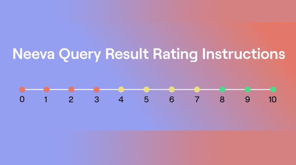
Page match. Neeva has its raters give a score to the match between the query and a webpage, between 1 (significantly poor) to 10 (vital). Here’s that scale:
- Significantly Poor Match. Does not load, page is inaccessible.
- Especially Poor Match. Page is wholly unrelated to the query. Missing key terms.
- Poor Match. Page may have some query phrases, but not related to the query.
- Soft Match. Page is related to query, but broad, overly specific, or tangential.
- On Topic but Incomplete Match. Page is on topic for the query, but not useful in a wide scope, potentially due to incomplete answers or older versions.
- Non-Dominant Match. Page is related to the query and useful, but not for the dominant intent shown.
- Satisfactory Match. This page satisfies the query, but may have to look elsewhere to round out the information.
- Solid Match. This page satisfies the query in a strict sense. There is not much extra, or beyond what is asked for.
- Wonderful Match. This page satisfies the query in a robust, detailed sense. It anticipates questions/pitfalls that might come up and/or adds appropriate framing to the query.
- Vital Match. This is a bullseye match. It is not available on all queries. The user has found exactly what they were looking for.
Source: Neeva shares search rating guidelines for technical queries
The new-look Gmail had landed, with one important addition

Google has announced it will begin to push its redesigned Gmail interface to all account holders.
Since the initial rollout earlier this year, the new email interface has been available to a portion of Gmail users on an opt-in basis. But now, the transition will take place automatically for those with Google Chat enabled, and can be triggered via the Settings menu by all other users.
The update delivers refreshed iconography, additional design elements and new color schemes. But most importantly, it brings to the fore the synergies between Gmail and Google’s other productivity and collaboration apps.
The new Gmail
Announced in early February, the new Gmail interface is designed to bring all Google’s communications services into one place, thereby minimizing the need to hop between multiple tabs when collaborating with clients and colleagues.
Under the new system, a panel on the left side of the email client allows users to navigate quickly between Gmail, Chat, Spaces and Meet. Depending on the services available under their respective Google Workspace plans, users can select which of these apps they would like to appear.
The company is also eager to shout about the Material 3 design language that underpins the new interface, which is said to deliver a “fresh look and feel” across the various interlinked applications. The aesthetic is characterized by a soft color palette and rounded edges, in line with the direction Google has taken the Android UI.
All in all, as much as some will want to cling on to the classic Gmail design (which remains an option), the new interface represents an upgrade for most users and the modest changes to core inbox functionality will mean the transition should be relatively pain free.
Source: The new-look Gmail had landed, with one important addition
WordPress Contributors Consider Renaming Full-Site Editing

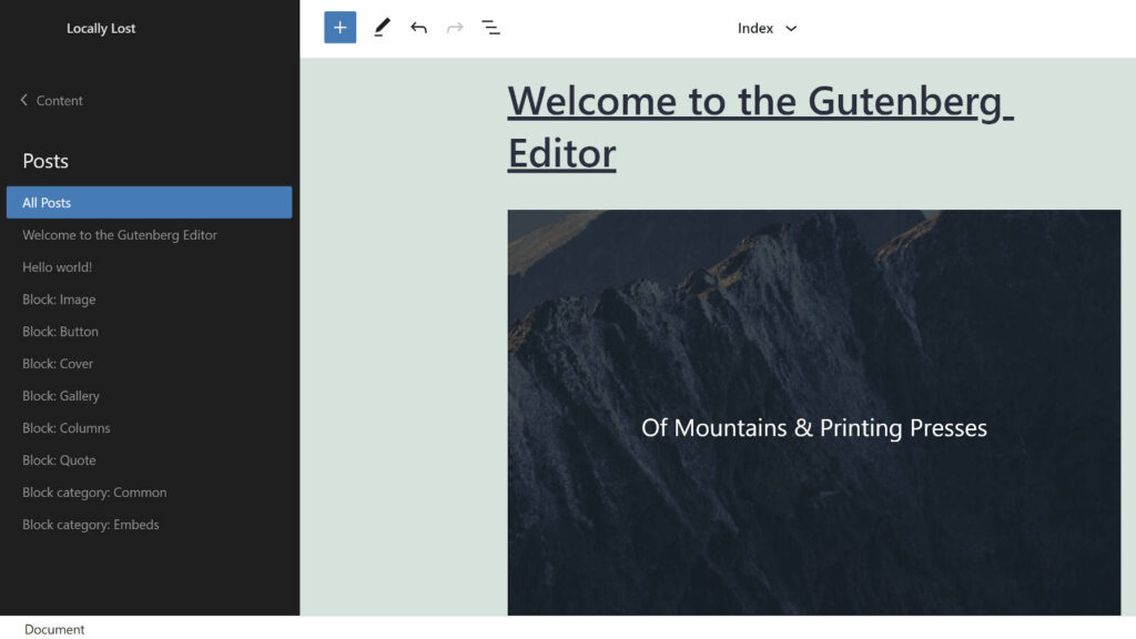
WordPress Executive Director Josepha Haden Chomphosy is proposing contributors rename the terms “full-site editing” and “full-site editor” to something more user friendly. The terms came into use as WordPress moved into the Customization phase and are still used to differentiate the work being done on site editing as opposed to content editing in the block editor.
Haden Chomphosy has identified two issues with using the term “full-site editing:”
- It was already possible to edit every part of a WordPress site using code. The term “full site editing” differentiated between phases of a project, rather than a new capability in the CMS.
- To us, “full site editing” implies the use of blocks, but for new users there’s no reason for them to expect anything else. The term isn’t descriptive of what makes it unique.
Contributors who work in WordPress every day may not be fully aware of how specialized some of these terms are and how little they mean to a newcomer. Haden Chomphosy proposes WordPress adopt a new term that is “immediately meaningful for new users of our software, while also being an easy to reference term for all of us building and supporting the software.”
She opened a conversation today on updating our shared lexicon to use a new term for this aspect of editing and asked for feedback on additional contexts that need to be considered.
Ideas are already pouring in as it’s much easier to name something than to build it. “Site Editor” has been one of the must popular suggestions so far, but participants in the discussion have also suggested “Template Editor” and “Theme Builder,” as well as “Builder” and “Site Builder.”
“Future view, looking back from collaborative editing, what I would want to tell a user: The Editor,” Rob Glidden said. “In the WordPress editor you and your team can edit posts, pages and themes in the same, consistent user interface.”
WP Engine developer advocate Nick Diego suggested it’s too late to unring the bell on full-site editing and that WordPress should stick with the term.
Source: WordPress Contributors Consider Renaming Full-Site Editing
More News:
GA4 now shows Performance Max and Smart Shopping data